Hansik
Korean food is reflective of Korea’s colorful, vibrant, and distinct cultural heritage and history. Hansik offers a taste of Korea by providing an array of recipes to guide people in learning how to cook Korean food. This mobile app serves as an interactive source of quality content that is accessible and comprehensive to better facilitate cultural education and appreciation through Hansik.
It has the following features:
Discover thousands of Korean recipes right at your fingertips
- Search featured recipes by popularity (from Korean dramas), by difficulty, or by category
- Search recipes by their Romanized & English names
Find ingredients easier
- Find local substitutes for Korean ingredients
- Create a shopping list
- Find Korean stores nearby
Cook with more convenience and confidence
- Access all multimedia reference in one place
- Put instructions in slideshow as you cook
Contribution & Tech Stack
Hansik is a semester-long (4 mos) project for my Human Computer Interaction Class (GCT505) during my first semester as a graduate student at KAIST. I worked with Hayun Kim, a graduate student from Culture Technology on this one. We went through one iteration of the end-to-end design process from user analysis, prototyping, and finally, to user testing. For this project, I did the planning and experimental design of the interview and user testing. I also did the development of the prototype in android .
THE DESIGN PROCESS
Part 1: User Analysis
Affinity Diagramming
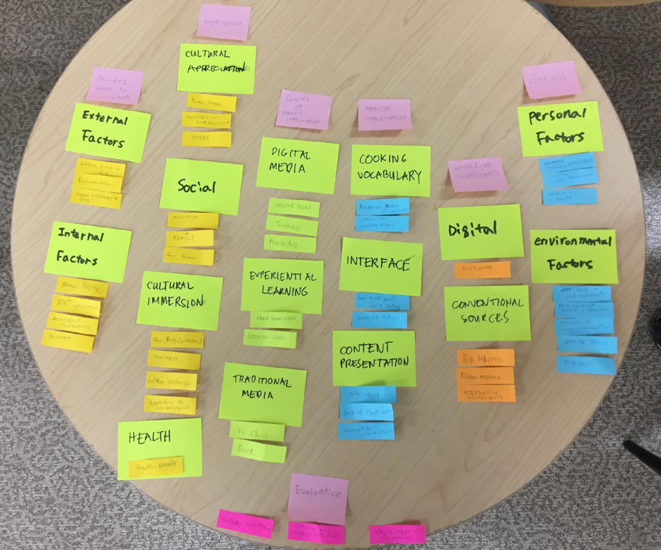
Interview

Contextual Inquiry
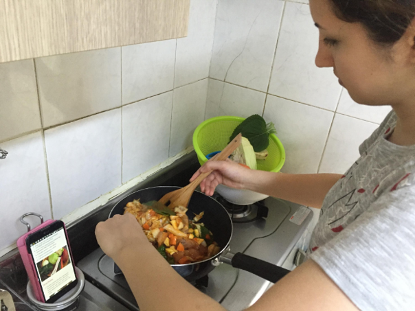
The demographic profile of our target users are single working millennials aged 21-35 years old who belong to class A, B, C. They are college-educated and are smartphone users. They live in prime urban locations. We have identified 2 personas from our analysis - expats living in Korea and Korean pop culture enthusiasts who live outside of Korea.
Personas

Emily the expat
“I believe that learning how to cook common Korean dishes will help me adjust to my new life in Korea.”
Motivations
- Cultural Immersion
- Adaptation to new sociocultural environment
Goals
- To be able to cook simple Korean dishes for myself and for my family and friends when I go back home
- To be able to modify Korean dishes according to my taste preference
Challenges
- Limited knowledge on Hansik
- Low tolerance for spicy food
- Unfamiliar ingredients
- Ingredient labels are in all in Korean
- Approximating the amount of ingredients in proportion to the desired serving size

Kat the K-pop fan
“Eating korean food makes korean culture more relatable. I want to be able to cook the dishes that I see in Korean dramas and TV shows.”
Motivation
- Appreciation of Korean traditional and popular culture
Goals
- To be able to cook the dishes I see in Korean dramas and TV shows
- To experience Korean culture even without visiting the country
Challenges
- Limited knowledge on Hansik
- Low tolerance for spicy food
- Some ingredients are not available locally or are of not the same quality
- Ingredient labels are in all in Korean
- Does not know the english name or romanized name of a Korean dish
- Approximating the amount of ingredients in proportion to the desired serving size
Storyboarding
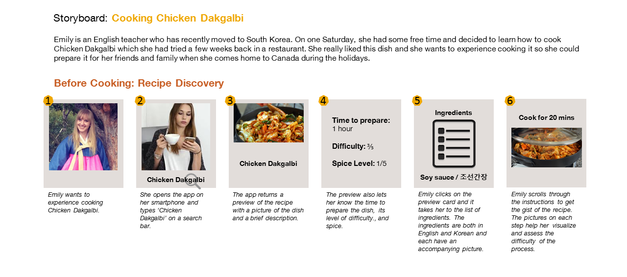
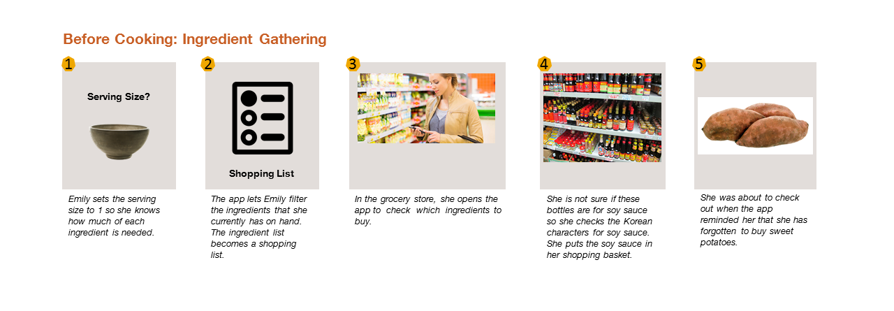
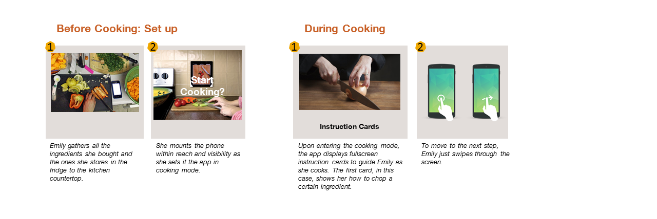
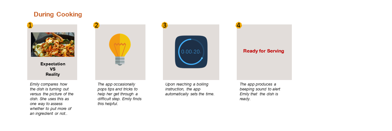

Part 2: Prototyping
We explored design alternatives based on content organization, navigation, and scrolling behavior. Our system must be able leverage on this design considerations to support the user at the major stages of cooking which are recipe discovery, ingredient gathering, and cooking.
Step 1: Recipe Discovery
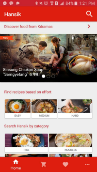
Home Screen
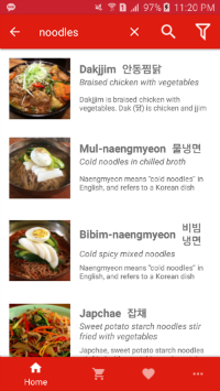
Search View
Search Filter
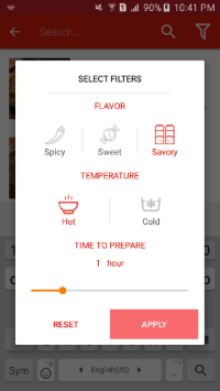
In the home screen of the app, we decided to put on a banner for showcasing recipes from popular dramas based on the insight that most of our users discover Korean food through this channel. We also sorted the recipes based on effort and food category with the assumption that users are on an exploratory mindset when using the app. This way, they can narrow down the search based on preference. We also incorporated filtering by temperature, flavor, serving size, and prep time into the recipe discovery experience as these were identified as key factors in deciding what to cook.
Step 2: Ingredient Gathering
Recipe Gist
Ingredients
Nearby Stores
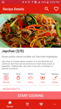
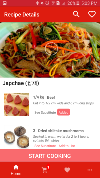
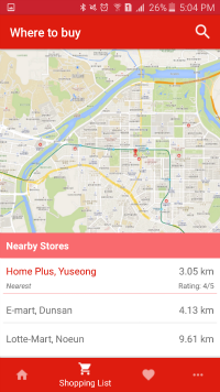
Our system assists the user in recipe gathering by presenting information in both korean and english, suggesting alternative ingredients, and providing images. This is a response to the challenges revealed by our user analysis which include inability to identify the right ingredients at the supermarket or local Korean store due to language constraints and unfamiliarity and unavailability of the said ingredients for those outside of Korea. We enable the user to create a shopping list while browsing the recipe gist without having to move out to another screen. Once the shopping list has been created, we supply a list of nearby Korean stores.
Step 3: Cooking

Slideshow
The biggest challenge we have identified for this step is keeping up with the recipe while following the instructions given the user’s wet and messy hands while cooking. It is not ideal for the user to have to navigate in and out of the app to set the timer or to look up information. A more desirable experience would be to keep the user within the app and limit the required navigations while cooking. To achieve this, we created a slideshow mode for the instructions which contains pictures and short video clips that the user can swipe horizontally. A timer is also built in for steps that require timing such as boiling, frying, etc.
Part 3: User Testing
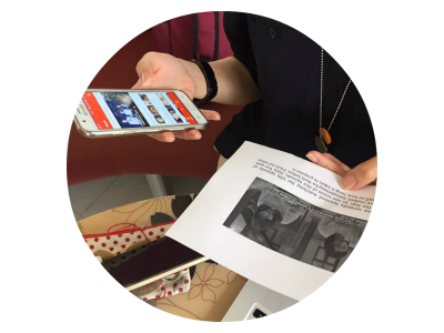
The goal for testing our first prototype is to determine design inconsistencies and usability issues. The scope of the testing was limited to the effectivity of navigation and content organization only. We designed tasks and scenarios that involved using a key feature, navigating across views, and looking for pieces of information. We also subjected the prototype to System Usability Scale (SUS) in which it scored above average. We found that the filtering option wasn’t easily discoverable and the users ended up not using it. Except for minor gaps in our design, the testers were generally pleased with its look and feel and deemed the app useful and recommendable.